
A store heatmap is the fastest way to see where shoppers actually go inside your store, which zones they ignore, and where the layout is quietly costing you sales. This guide is built for store managers and merchandising teams who already have a heatmap on the screen and need a 2026 playbook for reading it. We cover what a heatmap is, six steps to interpret one, how it differs from an e-commerce heatmap, the three patterns that should trigger a layout change, and how the data is captured without cameras.
What is a store heatmap?
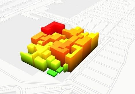
A store heatmap is a color-coded visualization of how shoppers move through a physical retail space. Warm colors mark high-traffic and high-dwell zones; cool colors mark areas shoppers skip. It is built from anonymous footfall and dwell data captured by ceiling sensors, not cameras, and updates daily or in near real time. Used well, a store heatmap turns a vague feeling about the floor into a specific decision: move that fixture, retire that endcap, reroute that aisle.
6 steps to read any store heatmap
Most retail teams stop at the picture. The picture is not the analysis. These six steps are what separates a heatmap that lives on a slide from a heatmap that changes the floor. Each step ends with one action a store manager can take that week.
1. Separate entrance attention from purchase intent
The hottest zone on most store heatmaps is the first three metres past the door. That is not a sales signal; it is a decompression reflex. Shoppers slow down to reorient themselves, then move on. Read entrance heat as attention, not intent. Pair it with the entry-to-purchase ratio for the category nearest the door. If attention is high but purchases are flat, the front-of-store fixture is decorative and should rotate to something seasonal or low-margin discovery, not anchor stock. Action this week: list the products inside the first three metres and check whether their category sales index is above or below store average.
2. Distinguish dead zones from intentional negative space
A blue zone on a heatmap is not automatically a dead zone. Some cold patches are designed: a wide aisle, a fitting-room corridor, a sightline gap that lets shoppers see the back wall. Real dead zones are blue patches surrounded by warm traffic that the floor plan expects to be active. Walk the floor with the heatmap printed: if the cold patch has product on it but no path leading to it, that is a true dead zone. Action this week: identify your top three true dead zones and decide whether to add a perpendicular fixture, change the SKU mix, or convert the patch to negative space on purpose.
3. Read the transition zones, not just the hotspots
Transition zones are the corridors between two warm areas. They show whether the path is doing its job. If two warm zones are connected by a cool corridor, shoppers are teleporting between destinations and missing whatever is on the corridor; that is a merchandising failure, not a layout one. Warm transition zones, by contrast, indicate that you have built genuine browse flow rather than two isolated islands. Action this week: name the three most important transition zones in the store and check whether their heatmap intensity matches the importance of their adjacencies.
4. Watch the fitting-room and demo approach lanes
In fashion, home, and electronics, the lanes that approach the fitting room or the demo bay are leading indicators for conversion. A warm approach lane plus warm dwell at the fixture before the fitting room usually predicts a basket. A warm approach lane that goes cold at the fitting-room threshold means shoppers are deciding not to commit; that is a stock-depth, sizing, or queue problem at the room itself. Action this week: overlay the approach-lane heat with the fitting-room utilisation rate and ask staff what is happening at the threshold during the cold hours.
5. Find the queue formation hotspots
Queue heat is misleading. A bright orange blob at the checkout looks like volume; it can also be a service-throughput problem. The way to tell them apart is to read the shape of the heat. A wide, even blob is volume; a long, narrow streak that backs up into an adjacent aisle is throughput. The second is the one that bleeds conversion, because shoppers waiting in the streak drift away from the basket they came for. Action this week: take the three densest hourly heatmap frames at the checkout and check whether the heat shape is a blob or a streak.
6. Always overlay peak-hour against off-peak
A single 9-to-9 heatmap blurs three different stores into one image: the morning errand store, the lunchtime browse store, and the after-work conversion store. Each one has a different floor pattern, and any layout change tuned to the blended average will fit none of them. Pull the heatmap for peak and off-peak separately and look for zones that flip. A fixture that is hot at lunch and cold after work is doing two different jobs for two different shoppers; treat it accordingly. Action this week: split the heatmap into two windows for the next four trading days and circle every zone whose temperature flips between them.
Store heatmap vs e-commerce heatmap: where the analogy breaks
The word "heatmap" travelled from e-commerce to physical retail, and the analogy is useful right until it isn't. A page heatmap from a tool like Hotjar measures clicks, scroll depth, and mouse movement on a single web page. A store heatmap measures shopper presence, dwell, and path through a physical floor plan. The instrumentation, the unit of analysis, and the decisions they enable are all different.
The differences worth pinning down before any team uses the term loosely:
- What is measured. E-commerce heatmaps measure cursor and scroll behaviour as proxies for attention. Store heatmaps measure actual physical presence and dwell time inside zones.
- Unit of analysis. E-commerce works at the page level (one URL, one heatmap). Store heatmaps work at the square-metre level inside one floor plan, with many zones running in parallel.
- Refresh cadence. E-commerce heatmaps roll up over a session window and update in near real time for any visitor. Store heatmaps typically present as daily, weekly, and hourly aggregates because the dataset is multi-shopper, multi-day floor traffic.
- Instrumentation. E-commerce uses a JavaScript tag injected on the page. Store heatmaps come from ceiling-mounted sensors that count and dwell-time shoppers anonymously at the edge.
- Privacy posture. E-commerce often relies on cookies tied to a session; consent is required. Store heatmaps from no-PII sensors do not identify individuals and do not collect biometrics, so DSGVO posture is different and usually simpler.
- Decision feeding. E-commerce heatmaps feed page-design decisions (copy, button placement, hero crop). Store heatmaps feed floor-design decisions (fixture placement, adjacencies, queue routing, staff coverage by zone).
If you have arrived from an e-commerce-heatmap workflow, the closest mental model is: imagine that each square metre of your store is a separate page on a website, and your heatmap is showing you the per-page dwell rather than per-page clicks. That is roughly what the data feels like, and it is why the layout decisions look different.
3 heatmap patterns and the layout changes they trigger
Three patterns recur often enough that any retail analytics platform worth using will surface them by name. Each one points at a different layout change.
Pattern 1: entrance crowding
A bright cluster in the first three to five metres past the door, with a sharp cooling beyond it, means shoppers are stalling in the decompression zone. The fix is rarely "add more product to the entrance"; that compounds the stall. The fix is usually to open the sightline, simplify the first fixture, and pull the eye to a second warm zone five to ten metres in.
Pattern 2: a single dominant dead zone
One large, persistent blue patch surrounded by warm traffic is almost always a path problem rather than a product problem. The product on the patch is not being seen because no one is being routed past it. The fix is to add a perpendicular fixture, rotate an adjacency, or move the path through the zone rather than around it.
Pattern 3: checkout queue overflow
A heatmap streak that runs from the till backward into the last shopping aisle is a queue-overflow pattern. The conversion damage is not at the till; it is in the aisle whose visibility is being eaten by people standing in line. The fix is queue routing, second-till activation at predictable peaks, and in the longer run, staff scheduling tuned to the hourly heatmap rather than to the daily one. The shopper flow patterns playbook covers the queue-and-aisle pattern in more depth.
How a store heatmap is captured without cameras
Most 2026 store heatmaps are not built from cameras. They are built from ceiling-mounted sensors that detect a human silhouette anonymously, count entries and exits, and time dwell inside defined zones. The data leaves the sensor as an aggregate count, not as an image. Nothing identifiable is sent to the cloud, which is what makes the DSGVO posture simpler than e-commerce instrumentation.
Three sensor families dominate; each has trade-offs:
- Stereo vision and Time-of-Flight (ToF). Two lenses or a depth sensor measure a silhouette, count it, and time its dwell. Accurate, well-suited to wide entrances and complex floor plans.
- Overhead radar and lidar. Lower-resolution presence sensors that work well in low-light or privacy-sensitive deployments. Coverage maps to square-metre zones.
- Wi-Fi or BLE presence. Estimates from device counts. Cheaper to deploy but lower accuracy on dwell and on shoppers without phones; better as a supplement than a primary heatmap source.
Whatever the sensor, the anonymization happens at the edge. The detection runs on the device; only counts and dwell figures leave it. That is the footfall and dwell instrumentation behind the heatmap, and it is what lets a retailer publish a store heatmap without storing footage or any personal identifier.
A named-case worked example: Deichmann
Deichmann is one of the largest footwear retailers in Europe, with a long-running heatmap and footfall measurement programme inside its stores. As a worked example of the playbook above, take a representative Deichmann shop floor. Entrance attention is typically high in the first three metres because of the seasonal collection placement, then cools as shoppers move toward the fit zones. The fitting-bench approach lanes carry the conversion signal: warm approach plus warm dwell at the size wall before the bench is the pattern that ends in a basket.
Reading the same store on a Saturday peak vs a Wednesday off-peak produces two different floors. The Saturday heatmap shows queue heat at the till that backs into the last aisle; the Wednesday heatmap does not. A layout decision tuned to the blended average would fix neither; the two windows require different responses. This is the typical pattern any retail conversion measurement platform should surface by default, and it is why a single all-day heatmap is rarely enough to drive a floor change.
Glossary: the heatmap terms that actually matter
Eight terms that recur across any 2026 store heatmap conversation. Knowing the difference between attention zone and hotspot, or between dead zone and negative space, is half the battle when reading the picture.
- Heatmap. A color-coded visualization of shopper presence and dwell across a floor plan. Warm colors mark high activity; cool colors mark low activity.
- Dwell time. The duration a shopper spends inside a defined zone. The strongest single signal of intent at a fixture.
- Attention zone. A warm patch where shoppers slow down and look, often without converting. Common at entrances and at category headers.
- Dead zone. A cool patch that the floor plan expects to be active. Surrounded by warm traffic but ignored; not the same as intentional negative space.
- Transition zone. A corridor between two warm zones. Warm transition zones indicate genuine browse flow; cool ones indicate teleporting shoppers.
- Hotspot. The hottest local maximum on the heatmap. Worth interpreting only after you have separated attention from intent.
- Isobar. The contour line that joins points of equal heat. Useful on dense heatmaps where the color gradient is hard to read directly.
- Peak-hour overlay. A heatmap restricted to peak trading hours, displayed alongside an off-peak heatmap so flipped zones become visible.
Related reading
FAQ
What does a hotspot mean on a store heatmap?
A hotspot is the warmest local maximum on the heatmap; it means many shoppers either passed through or paused there. It does not by itself mean those shoppers bought anything. To interpret a hotspot, pair it with the entry-to-purchase ratio for the nearest category and check whether the dwell time is long enough to imply consideration rather than just passage.
Do store heatmaps need a camera?
No. Most modern store heatmaps are built from ceiling-mounted sensors (stereo vision, Time-of-Flight, radar, or lidar) that detect a silhouette anonymously and send only counts and dwell figures to the analytics platform. Nothing identifiable is stored or transmitted. That is the standard 2026 deployment for retailers that need to keep DSGVO posture clean.
How often does a store heatmap update?
Most platforms aggregate the heatmap daily, with hourly or peak-vs-off-peak overlays available on top. Near-real-time heatmaps exist for live operations (queue management, on-shift staff routing) but the layout-decision view is usually the daily roll-up over a representative trading window.
How is a store heatmap different from an e-commerce heatmap?
An e-commerce heatmap measures clicks and scroll on a single web page from a JavaScript tag. A store heatmap measures physical presence and dwell across many zones on a floor plan from ceiling sensors. The unit of analysis (page vs square metre), the instrumentation (JS tag vs sensor), and the decisions they feed (page design vs floor layout) are all different.
How do I act on a heatmap that shows a dead zone?
First confirm it is a true dead zone (cool patch surrounded by warm traffic, with product on the patch and no path leading to it). Then decide whether the patch needs a perpendicular fixture to route shoppers into it, a different SKU mix to make the route worthwhile, or to be converted into intentional negative space (wider aisle, sightline gap). The wrong move is to add more product to the dead patch; that compounds the problem.
A heatmap is only as useful as the decision it triggers. If you want the footfall and dwell instrumentation behind these patterns running in your store, our retail analytics platform pairs the heatmap with the underlying counts so every zone you change has a baseline you can re-test against. The in-store customer journey mapping framework sits on top of the same data if you want to go beyond a single heatmap and instrument the full shopper flow.


