
Where kiosks go versus where they are needed
Walk any large venue and audit the kiosks: one at the entrance nobody has questions at yet, one in a corridor everyone passes at speed, one near the toilets because power was available. Kiosk placement is routinely decided by architecture and electrical plans rather than by need, and the result is the familiar sight of an expensive screen glowing alone while visitors ask staff for directions twenty meters away.
Where should wayfinding kiosks be placed?
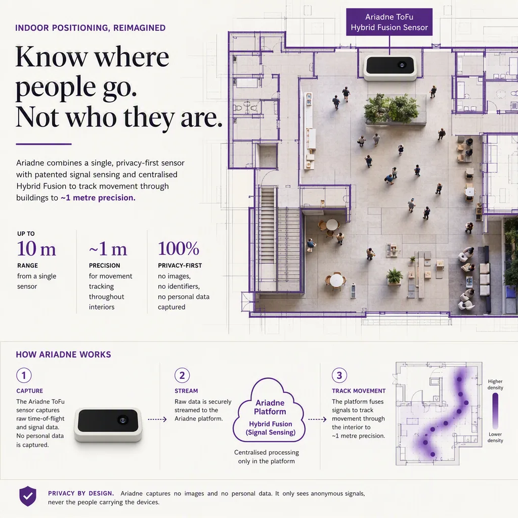
At measured hesitation points: the locations where visitor journeys demonstrably slow, stall, backtrack, or split. Flow data finds them empirically: dwell clusters that are not amenities (people stopping where there is nothing to stop for are people deciding), path splits where routes diverge by destination, backtrack points where journeys reverse (the signature of a wrong turn), and transition zones (lift lobbies, level changes, entrances from parking) where context resets. Place kiosks where deciding happens, not where power happens to be.
The placement method, step by step
- Measure the baseline. Zone-level journeys across the venue: paths, dwell, splits, reversals. Hesitation shows up as unexplained dwell and backtracking, readable in the same data as any journey analysis.
- Rank candidate points by hesitation volume times distance from the nearest existing help (staffed desk, board, kiosk). A hesitation point next to an information desk needs nothing.
- Pilot with the cheapest intervention (even a temporary screen or QR-code stand) before committing electrical work, the same A/B discipline as signage placement.
- Verify with usage and flow. A well-placed kiosk shows engagement AND reduces the hesitation signature around it: dwell-before-decision shortens, backtracking drops. A kiosk with heavy usage but unchanged hesitation is placed at the symptom, not the cause.
The mistakes the data keeps catching
Entrance-lobby kiosks placed before visitors have formed a question (the decompression-zone effect applies to questions, not just merchandise); kiosks on fast corridors where nobody will break stride; and single central kiosks in venues whose hesitation points are distributed at every vertical transition, where multi-floor routing confusion lives.
Where Ariadne fits
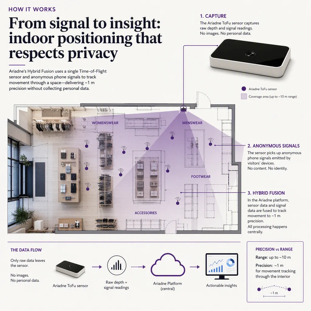
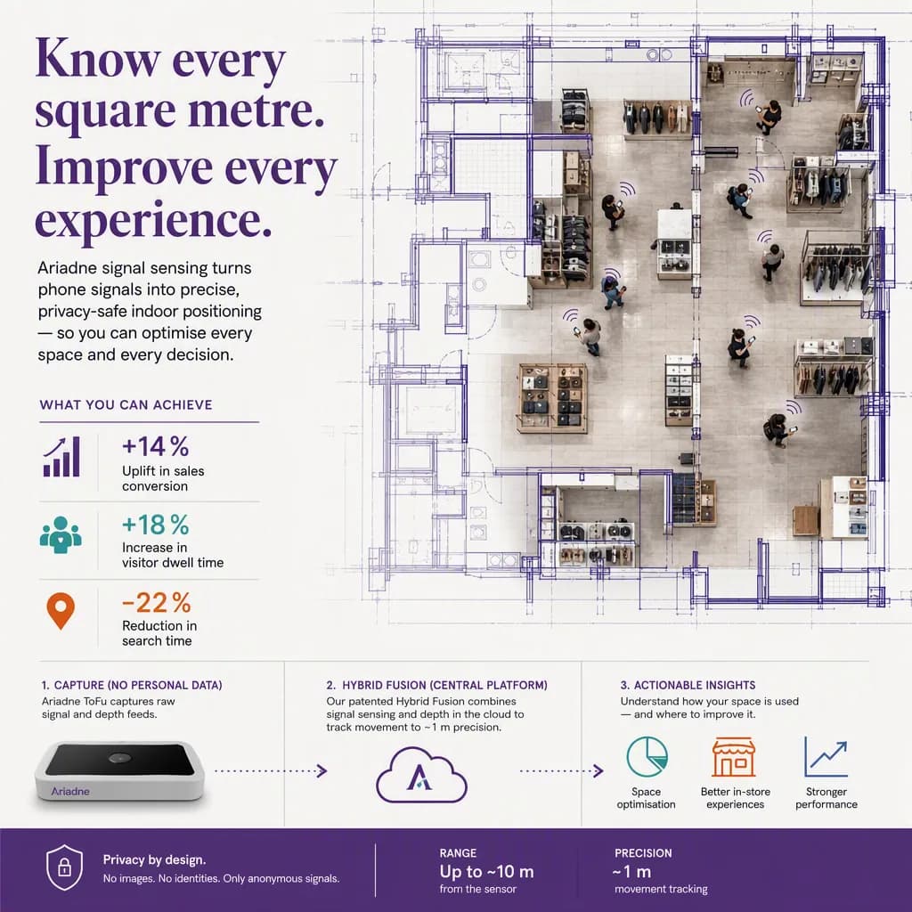
Ariadne provides both halves of this loop: the flow measurement that locates hesitation, camera-free and identity-free, and the kiosk endpoints themselves, fed from the same living map as app and web routes (the indoor navigation pillar has the platform picture). Placement stops being a fit-out guess and becomes a measured, revisable decision.
---


